Biola Logo Guidelines
Logo Significance
The Biola University logo is a trademarked symbol that — more than any other visual element — represents the Biola brand. It plays an important role in the university’s visual identity. It also serves as an official “stamp of approval” on Biola communications, helping to confirm their authenticity. Correct and consistent usage of the logo preserves the integrity of our brand.
But what does the logo mean? The mark consists of an open book and a flame, all contained within a circle. The book represents the Bible, and the fact that it is open implies that it is being studied and applied. The flame above the Bible represents God’s holiness and the enlightenment we can obtain from his Word. The circles represent the world, which the university is committed to reaching with the gospel of Christ.
Logo Variations
There are several approved variations of the Biola University logo, each of which comes in two orientations: vertical and horizontal.
Preferred Two-Color Logo
The preferred version of the logo features a red circle mark with black text. This version should be used whenever possible.

Reverse Two-Color Logo
The reverse two-color logo — with a red circle mark and white text — is used on dark backgrounds, such as black or navy blue. This variation of the logo should be used only when white text is needed for contrast and legibility and when the background color does not clash with the red circle mark.


One-Color Logos
All-white or all-black logos should be used only when full-color printing is not an option or when the logo is being applied to a background that would clash with the red mark. The all-white version should be used on a dark background, and the all-black version should be used on a light background.


Under certain circumstances and on certain materials, University Marketing will allow for the logo to be printed in a different color (such as gold on a Christmas card). In these cases, the logo is never separated into two different colors. It is always treated as one color.
Space and Size
Surround the logo with adequate clear space, as depicted below. The blue area must be kept free of other elements. The minimum required clear space is defined by the measurement “CS,” equivalent to half of the circle mark’s height or width.
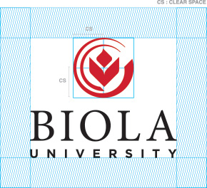
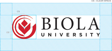
Logos should be sized appropriately for the piece being designed. To ensure legibility, the minimum size for the logo is 0.6875 inch wide for the vertical orientation and 1 inch wide for the horizontal orientation. Logos should never be presented smaller than the requirements depicted here.
Official Colors
Pantone Black
C:0, M:0, Y:0, K:100
#000000

Pantone 186
C:2, M:100, Y:85, K:6
#CC1122

Logo Misuse
In order to build and protect the Biola brand, it’s important to maintain correct and consistent use of the Biola logo. Occasionally — whether intentional or not — employees and third-party vendors have altered, distorted or otherwise misused the logo. Below are incorrect uses of the logo to recognize and avoid.

Do not use an outdated version of the logo.
(The simplest way to distinguish between correct and incorrect versions is by looking at the circle mark. In outdated versions, the smaller circle connects with the base of the open book. In the correct version, there is a clear space between them.)

Do not use any unapproved color variations for the logo.
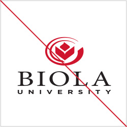
Do not stretch or distort the dimensions of the logo.
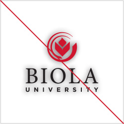
Do not apply a drop shadow or any other effects to the logo.
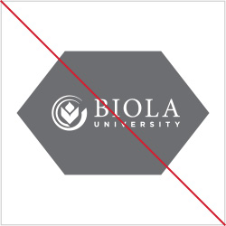
Do not place the logo in a container shape of any kind.
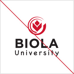
Do not substitute the typeface of the logo.

Do not add additional words or info beneath or beside the logo.
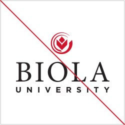
Do not adjust the position or ratio of elements within the logo.
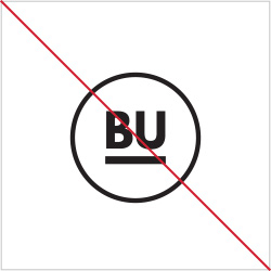
Do not use the BU icon in place of the Biola logo. It is a design element, not an identity marker.

Do not use the circle mark on its own, separated from the words “Biola University.”
